
The Colours Defining 2026
2026 is a year of grounded elegance in interior decor, with major brands like Pantone, Benjamin Moore, Sherwin-Williams, and Behr unveiling colours that emphasize warmth, balance, and timeless sophistication. Pantone’s “Cloud Dancer” sets the tone with airy softness, while Benjamin Moore’s “Silhouette” and Behr’s “Hidden Gem” bring depth and nature-inspired calm. Together, these palettes reflect a collective desire for interiors that feel restorative yet expressive.
Every year, leading paint brands and colour authorities announce their Colour of the Year, offering insight into cultural moods and design directions. For 2026, the choices converge around themes of comfort, refinement, and connection to nature.
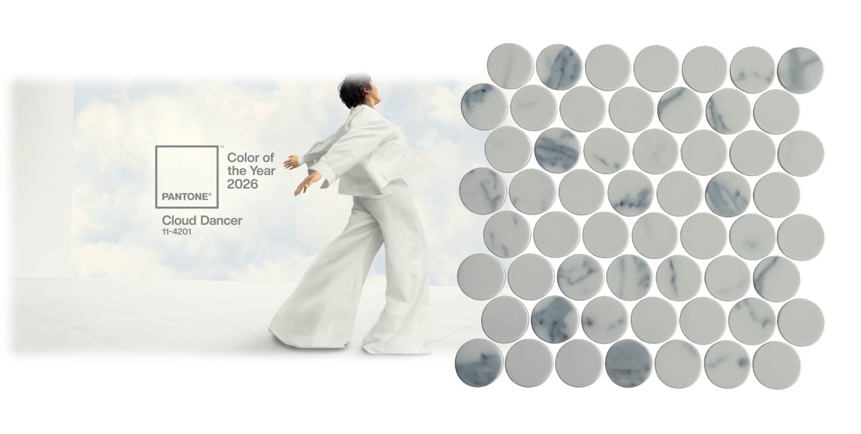
Pantone: Cloud Dancer (11-4201)
Description: A soft, airy white with warm undertones.
Why it matters: Pantone’s choice signals a return to simplicity and openness. White is no longer stark—it’s gentle, inviting, and versatile.
Decor use: Ideal as a base tone, allowing bolder accents to shine while maintaining serenity.
Matching with Mosaics: This one is an easy one as it’s a neutral, it can be used with almost any mosaic. Global Stone thinks that range that best represents the Cloud Dancer is our marble mosaics, specifically the Carrara marble look.
Sherwin-Williams: Universal Khaki
Description: A warm, earthy neutral that bridges beige and taupe.
Why it matters: Neutrals are evolving into warmer, more organic tones, reflecting a desire for stability and timelessness.
Decor use: Perfect for transitional spaces, creating a calm backdrop that pairs well with both bold and muted accents.
Matching with Mosaics: While we do not offer a mosaic with this exact colour, we believe that the pastel colours from the Spear Head Porcelain mosaic match both the colour and personality of Silhouette.
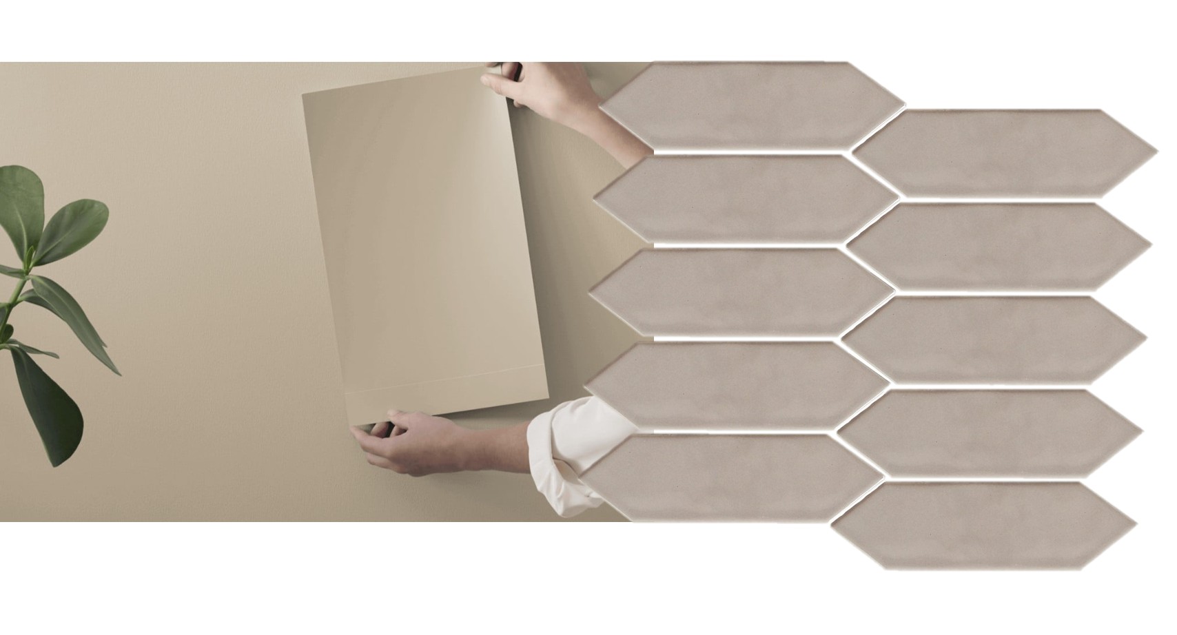
We have paired Caramelized with Dusty Cotta Fan Matt Recycled Glass mosaic.

Behr: Hidden Gem
Description: A smoky jade green with earthy undertones.
Why it matters: Green continues to dominate design trends, symbolizing renewal and wellness. Behr’s choice leans into sophistication rather than playfulness.
Decor use: Kitchens, bathrooms, and creative spaces benefit from this grounding yet energizing hue.
Matching Mosaics: Global Stone recommends one of our latest releases, Freccia Aquatica to match with Behr’s Hidden Gem. Both deep and rich colours complement eachother very well.
Benjamin Moore: Silhouette (AF-655)
Description: A deep burnt umber with smoky undertones.
Why it matters: This shade embodies sophistication and depth, offering a dramatic yet grounding presence.
Decor use: Works beautifully in dining rooms, libraries, or accent walls where intimacy and richness are desired.
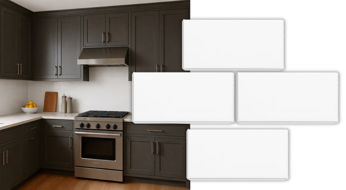
Matching with Mosaics: Global Stone recommends pairing this colour with any white mosaic. Silhouette is quite a bold and dark colour in itself, so we feel pairing with a clean light colour is best.

WGSN + Colouro: Transformative Teal
Description: A balanced teal that merges blue’s calm with green’s vitality.
Why it matters: Teal represents adaptability and emotional balance, resonating with the global push toward wellness-focused living.
Decor use: Accent furniture, textiles, or feature walls where vibrancy meets tranquillity.
Matching Mosaics: Adriatic Green Lantern Porcelain Mosaic matches Transformative Teal perfectly. It almost mimics the colour and is available here.
The Emotional Atmosphere of 2026
The collective theme across these colours is grounded elegance. Unlike past years that leaned into playful optimism or stark minimalism, 2026 embraces hues that feel layered, restorative, and quietly confident.
Neutrals (Pantone’s Cloud Dancer, Sherwin-Williams’ Universal Khaki) provide calm foundations.
Deep tones (Benjamin Moore’s Silhouette, Behr’s Hidden Gem) add richness and emotional depth.
Balanced accents (WGSN’s Transformative Teal) inject personality without overwhelming.
This palette reflects a cultural shift: interiors are no longer just about aesthetics—they’re about creating spaces that nurture well-being and authenticity.
Final Thoughts
The colours of 2026 invite us to design with intention. Whether it’s Pantone’s ethereal white, Benjamin Moore’s dramatic umber, or Behr’s smoky jade, each hue speaks to a desire for interiors that balance beauty with emotional resonance.
In 2026, decor is not just about what we see—it’s about how we feel.