
Grout as a Design Element: How Colour Transforms Tile Aesthetics
When it comes to tile design, grout is often the unsung hero—or villain—of the final look. While tiles tend to steal the spotlight, grout colour plays a pivotal role in shaping the overall aesthetic, mood, and style of a space. From crisp white to moody navy blue, each grout shade offers a unique decorative effect that can elevate or soften your design. Let’s explore how different grout colours—white, light grey, dark grey, and bold hues like navy—can transform your space.
White Grout: Classic, Clean, and Crisp
White grout is the go-to choice for timeless elegance. It’s
especially popular in kitchens and bathrooms where
cleanliness and brightness are key.
- Style Impact: White grout creates a seamless, unified look, especially when paired with white or light-coloured tiles. It’s ideal for minimalist, Scandinavian, or coastal interiors.
- Visual Effect: It makes spaces feel larger and more open by reducing visual breaks between tiles.
- Best Pairings: Subway tiles, marble, or ceramic tiles in light tones.
- Considerations: While beautiful, white grout is prone to staining and requires regular maintenance to keep its pristine appearance.

Light Grey Grout: Soft Contrast and Subtle Definition
Light grey grout offers a gentle contrast that adds depth without overwhelming the tile design. It’s a versatile choice that suits both traditional and modern styles.
- Style Impact: It brings a touch of sophistication and
works well in transitional spaces that blend old and
new. - Visual Effect: Light grey grout outlines tiles subtly,
enhancing their shape while maintaining a soft,
cohesive look. - White tiles for a gentle contrast, pastel tiles for a dreamy vibe, or patterned tiles to let the design shine.
- Considerations: It’s more forgiving than white grout in terms of staining, making it a practical yet stylish option.

Dark Grey Grout: Bold Definition and Industrial Edge
Dark grey grout is a favourite for those seeking drama and definition. It adds a strong visual frame to each tile, making patterns and layouts pop.
- Style Impact: Perfect for industrial, urban, or contemporary interiors. It adds a grounded, architectural feel to the space.
- Visual Effect: Creates a grid-like appearance that emphasizes tile shape and layout. It can make light tiles stand out dramatically.
- Best Pairings: White or light tiles for high contrast, geometric tiles for a modern edge, or natural stone for a rustic touch.
- Considerations: Dark grout hides stains well but may show efflorescence (white mineral deposits) over time if not sealed properly.

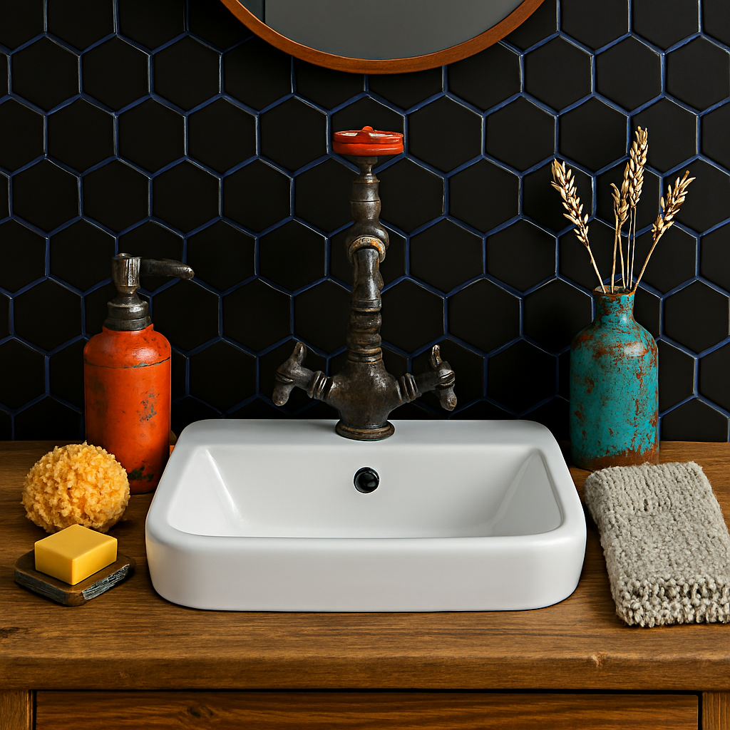
Coloured Grout (e.g., Navy Blue): Artistic Flair and Unexpected Charm
Coloured grout is where creativity truly comes alive. Shades like navy blue, forest green, or even terracotta can turn a tiled surface into a statement piece.
- Style Impact: Adds personality and flair. Ideal for eclectic, bohemian, or maximalist interiors.
- Visual Effect: Coloured grout can either complement or contrast the tile, depending on the desired effect. Navy grout with white tiles, for example, creates a nautical or Mediterranean vibe.
- Best Pairings: Neutral tiles for contrast, or matching tones for a monochromatic look with depth.
- Considerations: Dark grout hides stains well but may show efflorescence (white mineral deposits) over time if not sealed properly.
Final Thoughts: Grout as a Design Tool
Choosing grout isn’t just a technical decision—it’s a stylistic one. Whether you want your tiles to blend in or stand out, grout colour can help you achieve the perfect balance. Think of it as the outline to your artwork: subtle lines create harmony, while bold strokes make a statement.
So next time you’re planning a tiling project, don’t just pick grout from a practicality standpoint. Consider its decorative power. With the right shade, your tiles won’t just cover a surface—they’ll tell a story.
*View the Matt Black Porcelain mosaics featured in these images.